EHRs Built with Cognitive Design Could Lead to Happier Providers
EHR System usage is cited as one of the causes increasing burnout in healthcare providers, which could lead to a number of other issues like “rise in unprofessional behaviour, a drop in patient satisfaction and a greater chance that a doctor will make a major medical error.”
According to Dr. John Rogers, MD, one of the prime reasons is the lack of structure in presenting information. In his own words: “too often I pull up a record, either in peer review or another setting, and it’s almost impossible to really get an understanding of the story line. On a daily basis I can’t find the information, particularly nurses’ notes and [other information] that are really valuable to me.”
In this era of mandated technology, most health systems and larger ecosystems will adopt electronic health solutions. However, we cannot replace the experience and knowledge that providers bring to the table. Any true impact that technology will have will first garner the approval (and buy-in) of providers – tech must make practising their profession easier, not contribute to their burnout.
Interestingly enough, a few modifications of the EHR system could help reduce this issue. Cognitive design is “the art and science of bringing harmonic geometry to a conversation.” To put that in layman’s terms and as to how it relates to EHR, cognitive design is used to make tasks simpler.
Healthcare providers have important medical information they need to remember and understand – overloading their brain with a cluttered EHR system will detract from their effectiveness. They need an EHR that is simple.
An ideal EHR system is one that makes relevant features and information easily accessible, while eliminating distracting ones. This reduces the amount of data that providers have to process, which will let him or her worry about more important things like building patient rapport, diagnosing symptoms properly, and focusing on minimal (if no) errors.
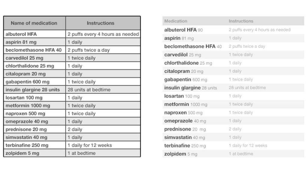
Let’s dig into a specific example of how cognitive design improves the user experience:
In the first example above, there are too many visual distractions. The frame and instructions draw attention through their dark, bold color and the design detracts from the focus: medication names and dosage.
The second image fixes these issues by removing the border, emphasizing the data that is primarily needed, and fading the less relevant information.
While the above seems like a small change, it could be the difference between a healthcare provider who is happy and easily focused on their work, and a healthcare provider who is unfocused and at risk of making an error.
Health records will be completely electronic soon enough, and it is imperative that we create systems that are easy to use. If our industry is going to rely on such tech, then we need it to reduce burnout in an already-stressful industry, not add to it.


